Style Guide for Scientific Papers

Photo by Debby Hudson on Unsplash .
Assumptions
We assume that the paper has several sections and that each section has a dedicated “writer” who is responsible for that section. A single editor aggregates them into the final paper. She must resolve conflicts as described below.
All authors share responsibility for the content and the message, but the technical responsibility lies with the individual section writers and the editor.
Plots and Graphs
Graphs are essential in expressing and visualizing thoughts. The primary rule is to make them consistent and uniform in a paper. The choice presented below may be a bit dated, so feel free to use another solution. Keep in mind that it’s better to align with all collaborators who generate figures and charts and adopt a single solution than just picking the most feature-rich, fastest, powerful (insert your favorite buzz-words here) solution.
The standard program for 2D plots in the final version of the paper is Grace with the default font size altered. This software is available for all relevant platforms and easy to learn and use. The data files are human readable and can also be accessed and edited by scripts (e.g. via Python).
Standard Template
We have used this template for 2D graphs Template for Grace . It produces the following chart:
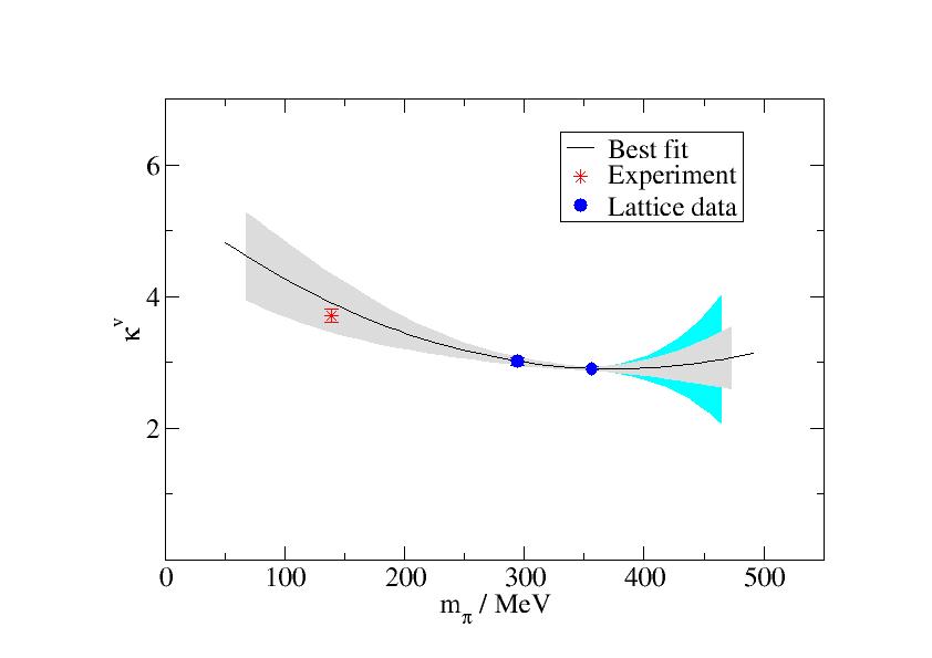
The plot contains experimental data, lattice data, and error bands. The color scheme is close to the default and is both easily readable and understandable.
The following rules apply:
- Any graph should tell a clear message. If we don’t know the message, don’t include the graph. The goal is to eliminate any superfluous information and distraction.
- The central value fit is a solid black line. In case of additional data points in the figure, the colors of the error bands correspond to the data points. If the data point symbol changes, the line remains black, and the line style varies, instead. The latter variant is discouraged unless essential since it lacks clarity.
- The default error band denoting statistical error is gray. Adding multiple error bands might clutter the graph too much. If necessary, this should only be done with different colors of the lattice data (see below), and the color should correspond to the lattice data fitted.
- The default systematic error band is cyan. Again, adding multiple systematic error bands might clutter the graph too much. It is discouraged to use multiple systematic error bands in one graph.
- Experimental data is red, multiple data in active colors. If necessary with error band. Suggested default is the star symbol.
- Lattice data is blue, solid disks as symbols. Multiple data sets
should vary style according to meaning:
- Colors should always be soft (blue, green, etc.).
- Different quantities (e.g. ΔΣ, Jq and Lq) in the same graph should alter the colors and the symbols.
- Similar quantities (e.g. ff data at different mpi) should alter the colors only, not the symbols.
- Changing both symbols and colors for the purpose of adding information to a graph is discouraged unless it doesn’t affect readability (which is unlikely IMHO).
- Quantities with physical units should always contain the unit in legends and axis labels. Default style is “Quantity / Unit”.
- Legends do not contain spurious information. If present, they can be placed anywhere on the canvas to minimize overlap with the figure. Default is upper right.
- Multi-layers (in the example from front to back: data, central value fit line, gray shaded error band for statistical error, cyan error band for systematic error) should be 5% shorter than the next-upper layer.
- Axis placement relative to the graph mass:
- Plots should leave 10% space on the x-axis at the left- and right side of a graph.
- Plots should leave 20%-30% space on the massive parts of the plot on the y-axis to the top- and bottom side of a graph.
- Unless it violates the previous rules, an axis origin should be included.
- Any rule can be broken if it enhances the message of the graph.
Creating Error Bands in Grace
Since several people have asked about this, I describe how to draw error bands using Grace.
Starting data
Prior to reading them in the error bands in Grace must be brought into the form:
<x_1> <y_1>-<yerr_1>
<x_2> <y_2>-<yerr_2>
...
<x_n> <y_n>-<yerr_n>
<x_n> <y_n>+<yerr_n>
...
<x_2> <y_2>+<yerr_2>
<x_1> <y_1>+<yerr_1>
This is the envelope of the error, i.e., the data forms a
“contour” on the canvas that can be interpreted as a
closed polygon. Therefore, the reversed ordering of the second half of
the data x-n back to x-1 is crucial. At this point the data is a
simple x y data set, no longer a data set of points with error bars
x y dy.
When computing the data we had typically used this form:
<x_1> <y_1>-<yerr_1> <y_1>+<yerr_1>
<x_2> <y_2>-<yerr_2> <y_2>+<yerr_2>
...
<x_n> <y_n>-<yerr_n> <y_n>+<yerr_n>
In order to reformat the data we used the following Python program:
| |
It accepts the filename as the first parameter, and the column offset
of the data with <y>-<yerr> as the second parameter. The former
parameter is required, the latter defaults to zero (it is only
necessary if you have additional columns inserted after the <x>
datum).
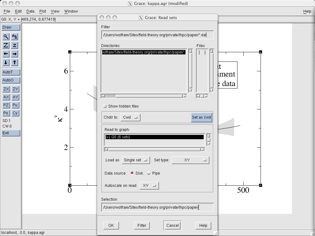
Getting data into Grace
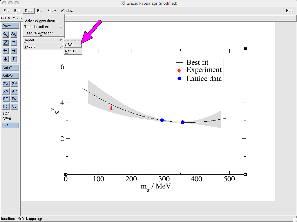
Once we have prepared the input as a text file, we import it in the
usual way via Grace’s Data → Import → ASCII...
dialog. We select the data, load a Single set and choose set type: "XY"
(as discussed above).
In the Plot → Set Appearance dialog, we select the data,
right click on it and choose Send to back. This way, it won’t be on
top of other information on the chart.
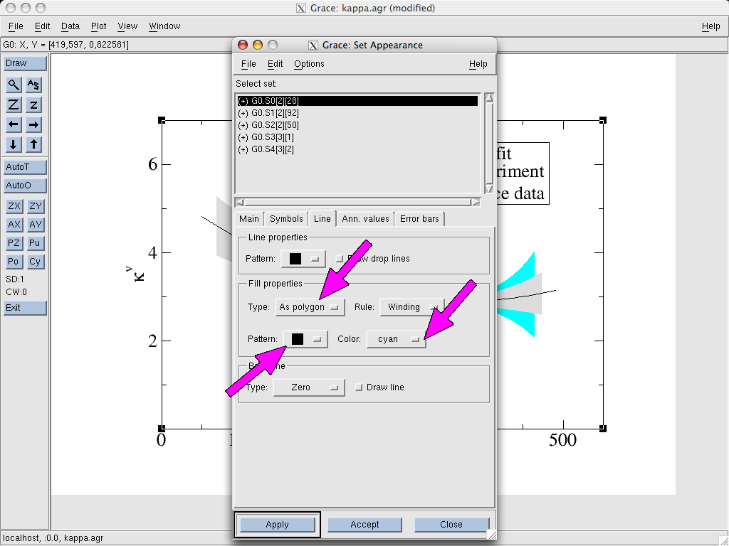
Showing the error bands
Next, we go to the Line tab and select the Fill properties. We
pick the Type As polygon and choose a solid pattern and color (in
the example it is “cyan”). The rest can be left
unchanged. Additionally, we should also set same color in the Line properties part on the first tab (Main). Otherwise, the error band
will have a contour around it plotted in a different color.

That’s basically all there is to it. We can still play around with settings (to send systematic error bands to the back behind statistical ones etc.). There is little need to tinker with the other settings since in most cases the default options are fine and/or already set in the sample graph linked above.
Equations and observables
Overview
This style guide standardizes notations for equations, observables and symbols and finally some miscellaneous items. Notations follow the former paper on GPDs, arXiv:0705.4295, unless otherwise explicitly stated.
General
The following general rules apply:
- Labels follow the convention used by
RefTeX. Prefixes
for equations are
eq:, sectionssec:etc. - References follow Phys.Rev. standard where applicable.
- Bibliography is handled by BibTex. Symbol names follow Spires database if possible. Note that the BibTeX-symbols generated by the database are not guaranteed to be unique! This means that conflicts may need to be resolved manually!
- Every section writer provides her own BibTeX file.
- Conflicts during merge are handled by me (Wolfram Schroers).
- Names should be canonized and employ properly escaped special characters (where known). This is not the default in the entries automatically generated by Spires. It certainly would be asking too much to read and translate any possible code in all possible formats, so we need to do some manual work here.
- Figure and table captions contain a brief description of content. Interpretation and details are explained in the main text.
Equations
For equations the following rules apply:
- For equations references use
\eqref{eq:X}. - Section writers can assume all form factors, GPDs, PDs (i.e., all relevant observables) etc. are already defined in the introduction. Appropriate labels will be announced later. Placeholders can be used until then.
Symbols
For the symbols we use:
- Quantities in lattice units are written as
$$(aX)$$, whereXis the entity in question. - Entities in physical units are written as
$$X$$ Unit, e.g.$$500$$ MeV. - Ranges in physical units are surrounded by braces,
e.g.
$$(300-700)$$ MeV. - Default unit for particle masses is
\(MeV\)
.
- Default unit for virtual momentum transfer is
\(GeV^2\)
.
- Plots of virtual momentum transfer plot
\(Q^2 / GeV^2\)
with the origin in the lower left corner.
- See arXiv:0705.4295, Figure 1, Section II for notation and meaning of kinematic variables.
Addition: In the form factors section we introduce \(Q^2=-t\).